Lead Product Designer/2024/Real Estate
Lifting Find Your Home completion by 31pp for a Top-11 U.S. homebuilder


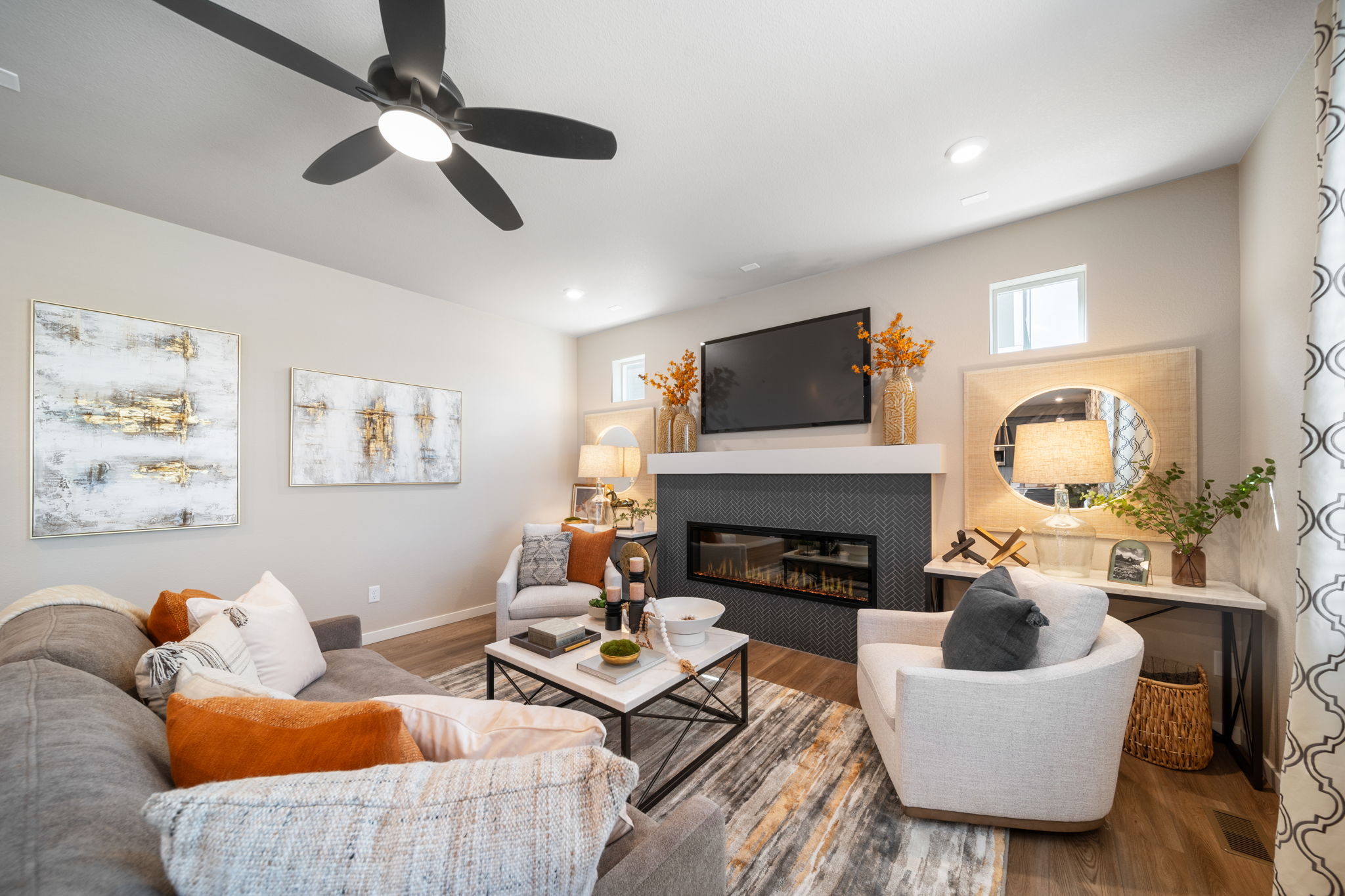
I led the redesign of Oakwood Homes’ digital homebuying platform — a Top-11 U.S. homebuilder selling configurable homes to first-time buyers across multiple metros. The job was to take a fragmented buying journey full of forms, plan choices, financing options, and design packages, and turn it into something a buyer could finish in one sitting with the confidence that they understood what they had just bought.

Buyers stalled at the moment trust mattered most
The existing platform was missing the basics — clear navigation, decision support, accessible filters, persistent reference to pricing and packages. But the deeper problem wasn’t friction in the conventional sense. It was that first-time buyers were being asked to make six-figure commitments at moments when nothing on the screen was telling them why they should feel confident in the next click.
Drop-off showed up sharpest in two tasks. In a controlled study with 37 participants aged 26–49, only 60% completed “find an available home” within a typical time range, and only 80% completed “configure and buy” — with a wide spread on both. The numbers said hesitation was real, distributed across the journey, and concentrated at moments where the interface stopped explaining itself.
13716 E 103rd Avenue Commerce City, CO 80022
Select Your Package

Basic
Explore

Standard
Explore

Deluxe
Explore

Premium
Explore
1
Select Package
Customize your dream home
2
Secure Your Spot
RSVP to our event
3
Get Prequalified
Prequalify with our qualified lender
Not Submitted
4
Submit Your Deposit
Reserve you desired home
Need help?
Feel free to speak with a live person now, and we will help guide you through this process
Confidence broke down between steps, not within them
I ran the same study before any design changes — recorded sessions with all 37 participants and watched where they paused. The pauses weren’t where the brief had predicted. People didn’t get stuck filling out forms or comparing plans; they got stuck transitioning between them. A user would finish configuring a kitchen package, then look for what came next, then back-button to check whether the price they’d seen earlier had updated, then second-guess the package they’d just chosen.
That reframe changed what the redesign needed to deliver. The original brief had asked for clearer CTAs and better filters, both of which were true requests. But the bigger lift was on the connective tissue — the headers, summary bars, sorting, persistent pricing references, the way each step ended and the next began. The journey wasn’t broken inside the steps; it was broken in the joinery between them.
Each decision got its own moment of calm
The redesign treats every step in the journey as a contained decision. Each screen names what’s being chosen, what it costs, and what it doesn’t commit you to. Persistent reference buttons keep pricing and package choices visible from the top of the page so users don’t have to back-button to remember what they’d selected. Filters in the Find Your Home flow were rebuilt to follow the same labeled, accessible pattern every interaction in the platform uses, so a buyer who learns the first filter knows how all of them work.
For the configurator, incentives were redesigned to give users explicit control — choosing among bundled options rather than discovering them buried inside a designer-selected default. Sorting moved to a clear H1 on the map view so the right results surface without trial-and-error. And a 24/7 AI live chat sits inside the flow, not adjacent to it, so buyers can ask the questions they don’t want to ask a sales rep without losing their place.
After shipping, I re-ran the same 37-person study with the same tasks. Find Your Home completion climbed from 60% to 91% — a 31-point lift — with the time spread cutting from 28 seconds to 18. Configure and Buy climbed from 80% to 94%, with the spread cutting from 86 seconds to 42. The headline number tells the story, but the spread numbers are what I’d point to in a design review: hesitation didn’t just decrease, it consolidated.


Select package
What “completion” really measures
For a first-time buyer, completing a digital homebuying flow isn’t a usability metric — it’s an act of trust. The version we shipped didn’t add the most ambitious features I’d scoped; it stripped out the moments where the platform stopped explaining itself. Most of the work was unglamorous: persistent pricing headers, consistent filter labels, sort affordances that don’t make users guess. The win was that those small clarifications stacked.
I keep coming back to this when I work on high-stakes consumer flows. People don’t abandon because a UI is ugly. They abandon when, somewhere between two screens, the interface stops giving them a reason to take the next step. The conversion you want lives in the joinery, not the destinations.